How to Make a Compelling Artist Website

The disruption of 2020 meant that most people were not able to see artwork in person. Instead more attention is on the digital sphere and its ability to better showcase artists around the world. Megan Canning and Rachel Crawford, who run Constellation Collective, a company that helps the creative industry with communications strategy, content strategy, and digital accessibility, share their 25 years of expertise on how to make a compelling artist website.
Canning and Crawford spoke about their Creative Capital workshop, what makes a great website, and why it’s important to have one in the age of social media.
Alex Teplitzky—Can you talk briefly about your backgrounds that helped you come into this work?
Megan Canning—Well, first, I’m a visual artist. So how I share my own work with others—both in person and online—is something I’ve been thinking about for decades now. I believe that communication is about connection. Connecting us to one another, to issues we care about, and to the world we live in. Communication strategy in the broadest sense (and by that I mean digital, social, brand, print, visual, etc.) is something I didn’t intend to focus on when I started working in the art world 20 years ago. But when I moved into the nonprofit & philanthropic sector it really hit me how critical effective communication was to not only doing the actual work, but to making change happen, and bringing people along with you in the work you are doing. I realized that my visual acumen combined with my ability to think creatively, strategically, and holistically lent itself really well to communications.
Rachel Crawford—I studied acting at NYU, and started my career in non-profit theater at HERE Arts Center and then the Brooklyn Academy of Music. I’ve always believed in the power of art and artists to speak to cultural moments in a profound way, and to change lives. From there, I somewhat accidentally ended up at a branding and design agency, and ultimately came to focus on digital content and strategy. A lot of my career has been learning on the job and seeking out information on topics I’m interested in. It’s such an incredible time for the democratization of information. In an ideal world, I’m able to blend my passion for art and artists with my professional expertise in digital strategy.
Alex—What’s the first thing you notice when you go on an artist’s website?
Megan—Oof. Usually what I see first is how outdated the site and the content is. (And I’m including myself in this as well.) How disorganized the navigation and content is. How small the type is. How old the copyright notice is. Or, I notice what is missing from the site, like a bio or artist statement or news about upcoming exhibitions, events, performances. And then I get frustrated and stop looking.
Rachel—Whether there’s clarity of purpose. What is it the artist is inviting us to understand or do with their website? That helps me connect to where they are in their practice this moment. So whether they’re pointing me toward an upcoming gallery show, or images from a recent performance, or just super clear information about where and how to acquire their work, that’s what I want to know. But frankly, most artist sites don’t deliver on that very well.
Especially for artists without robust representation, a website is your opportunity to tell the world about yourself and your work, sell your art, bring attention to the causes you care about, and connect with various communities.
Alex—Are there any artist or non-artist websites that you are inspired by, or feel like are a good example of what an artist website should accomplish?
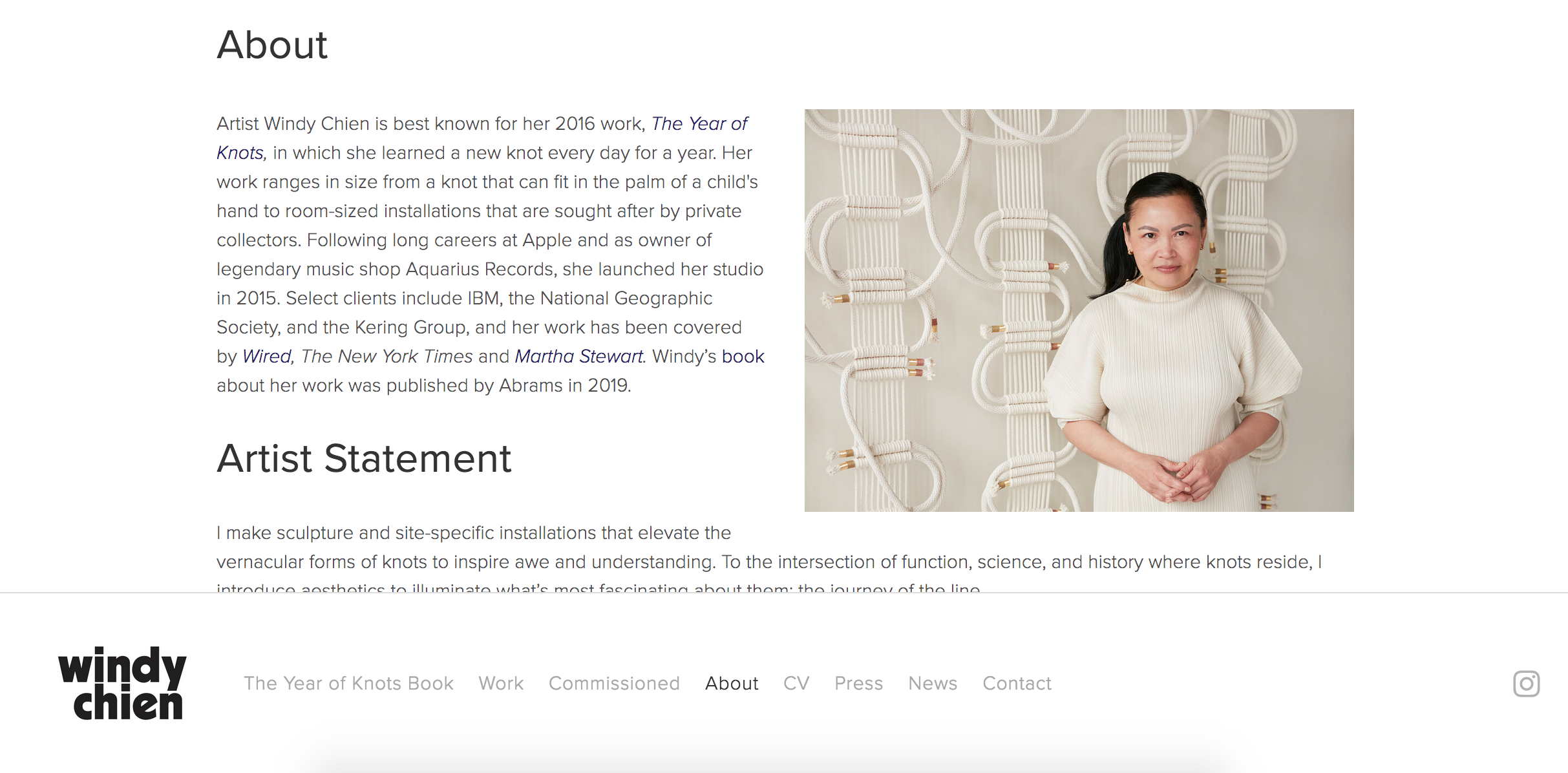
Rachel—Windy Chien is an artist that I love, and whose site I think is super effective. Windy’s site answers all of the questions I have—where can I get her book? When are her upcoming exhibitions? What is her work about? In particular, her “About” page is well-done. There’s a brief third-person “about” statement, as well as her “official” artist statement, followed by a more personal “Hello” section with more of a non-art bio. It really gives you a flavor for her not just as an artist, but as a person.

A screenshot of the “About” section on Windy Chien’s website, taken November, 2020.
Megan—Most artist websites are not presenting their work in an effective, authentic, and well-organized way. And I totally get why—artists want to spend their time making their work, period. Our time making our work is the priority, and it is precious. I read a study recently that said only about 5% of artists earn a living wage from their artwork. Which means the rest of us are working other jobs and trying to squeeze out as much time for our artistic practice as possible. We don’t want to have to spend a lot of time fussing about with a clunky website platform or updating our site all the time. But just like your artwork evolves over time, so should your artist statement and your website.
Alex—I’m always surprised when pretty well known artists don’t have websites—they either rely on social media, or another organization’s page about them. In this age of so many platforms, why is an artist website important? How should it serve the artist?
Rachel—Maybe there’s your answer! If they’re well-known already, perhaps they’re not worried as much about online presence. Social media is obviously a powerful tool for artists. There’s so much more organic discovery and less gate-keeping there—you don’t have to visit galleries (or be able to afford tickets to live performances) to find new artists. But artists can’t rely on algorithms to display content to everyone in a timely manner.
Websites, even simple ones, provide a permanent (and more flexible) home for information that’s not displayed at the whim of a giant tech company. So for a would-be collector, potential funder, member of the press, or even an interested family member or friend, a website is a much better home for up-to-date information. And it’s suited for more in-depth content than an Instagram bio can provide. Especially for artists without robust representation, a website is your opportunity to tell the world about yourself and your work, sell your art, bring attention to the causes you care about, and connect with various communities. A website can serve artists in a whole host of different ways, depending on their medium and the kind of experience they want to give visitors.
Megan—I am often surprised by that as well. Especially when owning your own story and how your work is presented to the world is of the utmost importance for most artists, in my experience. So to give that power to other institutions and organizations to speak for you is surprising. But if you are an artist that feels strongly that “the work should speak for itself,” then not having your own site could be part of your strategy. Art history has placed a lot of emphasis on the personal lives of artists as a means to interpret their work, often to the detriment of the artwork and the artist. So I can see why some artists may make the decision not to have their own site. But I want to see how they present their work and themselves to the world. Not how this gallery or this organization or this grantmaker or curator sees their work. What does the artist see as most important? What do they say in their artist statement? What is their vision?
Alex—Can you talk a little about what it means to make a website accessible?
Rachel—Digital accessibility is about making content online available to people with disabilities. So to oversimplify it, that could mean adding captions to your videos for people who are deaf, or adding text descriptions to your images for people who are blind. But it’s so much more than that. It’s really an issue of social justice. Society makes disabled people invisible by locking them out of everyday experiences, but it doesn’t mean they’re not here, or that they don’t deserve the same access to art and culture and digital life as everyone else. In the same way we need to focus on inclusion and representation in terms of race, gender identity, and sexual orientation, we need to understand the ways in which our world excludes people with disabilities. We have a free 45-minute webinar that helps explain why accessibility is so important—and really encourage folks to start there if they want to have a better understanding of the issue. Only then will the specifics of making websites accessible start to really make sense.
Alex—Has the pandemic changed how you think about individual artist websites at all?
Megan—Not being able to see art in person because of COVID-19 has been a source of sadness for me. It is fuel for my creative brain. So now I seek out art online, in gallery walk-throughs and artist talks and studio visits. It is not the same but it is the closest we have right now. At a time when most of our experiences (cultural, personal, and professional) have moved almost exclusively online, there’s a real opportunity to think more strategically and creatively about your digital content – whether you are an artist, a curator, or an arts organization.
Rachel—Perhaps only in the sense that now we are even more starved for connection, and art can provide such an incredible mirror to society during complicated and challenging historical moments like this one. While a website may not be the ideal medium for most artists to share their work, it’s what we have right now. It’s a platform that can feel complex or overwhelming. But one thing we always stress with personal or small-scale websites is that it’s not worth building something you can’t maintain, or that’s going to add a ton of stress to your life. Keep it simple, clear, and authentic, and you’re ahead of the game.
Learn more and sign up for their four-part workshop, starting November 19.
